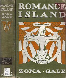
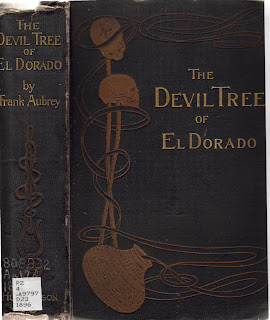
so. i love these covers and i love the titles. i wish you could see the tables of contents inside some of them or read these funny, mystifying stories. there is something charming and amusing and so odd about American and British culture at the turn of the last century and into those first decades. it is a quality that seems totally lacking in our world now. i don't know what it is. all i know is that i absorb a little bit of it each week at work as i dive back into the book culture of the time in search of sympathetic methods of repairing these little buddies. and in search of tidbits about book manufacturing of the time that fascinate me.
while the practical demands of my workplace cannot be met by approaching the zillions of books that come our way with a strict, conservation/restoration approach, it's a shame to me to lose these covers: these books in their whole, original form--and especially through their cover designs and materials--preserve and communicate so much about the world that created them.
so, take a look. thanks to the call number stickers, you can see the publication date on most these titles. any titles without a date in the call number are first editions. the last few titles come from the tale-end of the last awesome and ever-so-eclectic phase of the victorian publisher's binding-o-rama. i like these the best of the lot, but i'll wait to say which is my favorite until i hear from some of you which are your faves....


the following are identical editions but with very different covers.


6 comments:
Ok the cover I like the Best was Dr. Huguet by Igatius Donnelly - I think I like the type and the positoning of the title. Also the name Igatius.
But the best title - for sure - is "The Asbestos Society of Sinners"
Are you being influenced by Twilight or is the professor that is sending these your way trying to weed the shelves in his own subtle way?
I have to say, I agree with my mom on both accounts. I also really like the designy aspects of The Man Wolf. Very Bold. I like.
A Strange Manuscript Found in a Copper Cylinder. Sounds gripping. ;) (My favorite title-wise is the Asbestos Society of Sinners.)
Pear! That was my pick! Oh, YOOUUUU! I think it was the cover that grabbed me more than the title. But the title is perfect. Ok, I guess I'll share with you pear (or better yet, Bid, find me another book please . . . .)
Oh, these crack me up.
I get quite a kick out of The Devil's Spoon, actually. Partly because of the clashing colors and chunky, misproportioned geometric font. (You totally couldn't have gotten away with that capital S ten years later; the Nazis ruined it.) Partly also because I love bathos, and this is bathos in its most compact form. Not sure whether that's on purpose, but...
Hey, and in fact, we have a design from ten years later. The cover on The Death Star is already so very different ... so mid-century, and so military. I get the impression that design would have gone over really well in the Soviet Union at the time, too.
A Strange Manuscript Found in a Copper Cylinder is one or two slight details away from foreshadowing the Dead Sea Scrolls. Hmm.
Nu. For overall design, as well as title, I'm going to have to give it to the Asbestos Society. It's wonderfully striking.
The minimalism of the decoration combined with the type of "Doctor Huguet" looked rather nice with the used and tattered cover. (Surely the binders said "this will age handsomely") The "N"s in the authors name are all flourished differently. Try that one, font foundries.
"Travels in the Interior" wins for its editor, a London Physician. Clout, man.
Post a Comment